When analysis is effortless, every gathering becomes a dataset.
A friend was visiting from out of town and wanted to celebrate his birthday.
We decided on a blind pastry tasting competition, with a specific focus on croissants. Anyone could bring three of the same croissant from a bakery they liked. We ended up with 11 entries, and each entry was cut into 12 pieces, one for each person to sample. Participants would rank them from 1 (most favorite) through 11 (least favorite). Debate was encouraged, but nobody knew which croissant came from where or who brought what until all the rankings were in.
On a Saturday afternoon, we gathered around a table covered in buttery delights from across the Bay Area, chewing carefully, waxing poetic, and writing down our preferences.
The Leaderboard
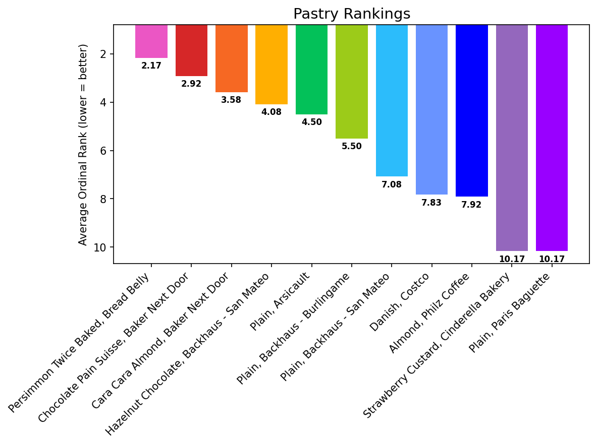
Bread Belly’s Persimmon Twice Baked croissant won with an average rank of 2.17. Nobody ranked it below 5th.
Baker Next Door placed two entries in the top three. Paris Baguette’s plain croissant and Cinderella Bakery’s strawberry custard tied for dead last at 10.17, and that was actually the strongest agreement in the entire dataset. The group agreed more about what was bad than what was good.
The Costco Danish, at $2.16, landed 8th. Not bad for something that costs a quarter of the winner and isn’t even a croissant, which some of us penalized it for.
The Laptop at the Party
As people were tasting, I had my laptop open with Claude Code running. Before the first bite, I’d prompted it:
“Be prepared to use Python and seaborn to produce tables and visualizations for a pastry tasting competition.”
The scaffolding was up in minutes. As rankings came in, I logged them into a spreadsheet and asked for analysis on the fly.
“Which croissant is the most controversial?”
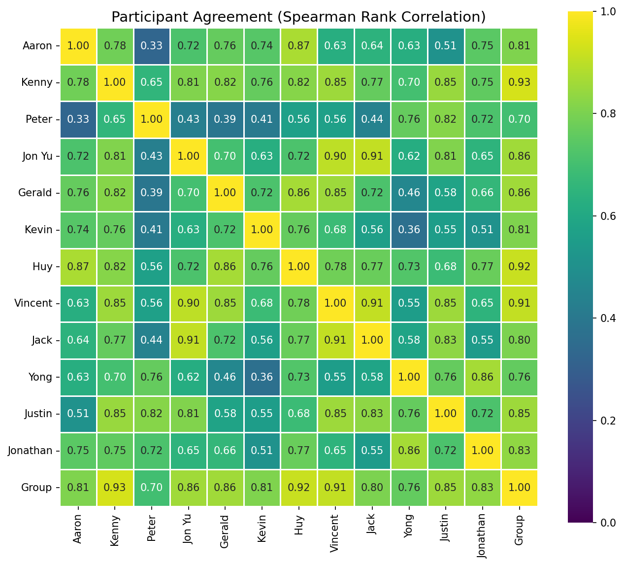
Backhaus Burlingame’s plain croissant: One person ranked it 2nd, another ranked it 10th. Standard deviation of 2.75, highest in the dataset.
“Who had the most similar tastes?”
Jon Yu, Jack, and Vincent formed a “taste trio” with correlations above 0.90 — nearly interchangeable palates. Kenny’s rankings were the most representative of the group. Peter was a statistically verified contrarian, averaging 0.553 correlation against everyone else.
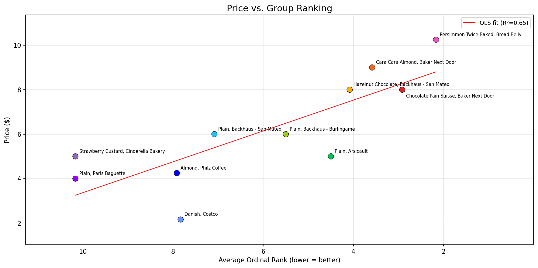
“Does paying more actually get you a better croissant?”
A price-to-quality regression with an R-squared of 0.65 is meaningful but not decisive. Arsicault’s plain croissant at $5 ranked 5th, punching above its price. The top three were all $8+ specialty items.
Answering these questions would normally require loading data into a notebook, importing pandas, choosing the right correlation method, interpreting the output. Not hard, but deliberate. The kind of thing you’d do after the party, if you did it at all.
Instead, all of it happened during the party. I wasn’t locked in a corner staring at a screen. It felt like texting — a question here, a prompt there, glance at the output, asking for small tweaks. By the time the last croissant was ranked, the full analysis existed and it was polished.
I should be honest about where my own expertise mattered, though. I started with seaborn because I knew it was a library that makes it easy for Claude to generate nice-looking plots out of the box. I knew Spearman correlation is more appropriate than Pearson for ordinal data. I caught duplicate rankings in the CSV that would have silently skewed results. I verified the correlation math by running it against a random baseline to make sure it zeroed out. Without those checks, the output could have looked just as polished but been subtly wrong.
How much longer that kind of knowledge stays necessary, I’m not sure. We did this on a laptop. A month from now, the same thing could probably happen from a phone. And a bit beyond that, nobody will need to know Spearman exists. The model will pick the right method, validate the input, and check its own work without being asked.
Effortless Depth
What we produced that afternoon — correlation matrices, price regressions, controversy rankings, taste clusters — used to require more intention. You’d need to care enough to sit down after the event, set up an environment, wrangle data, iterate. The effort was a filter. Only things you really wanted to analyze got analyzed.
It feels like that filter is mostly gone now. Everyone wanted to know which croissant won. Most people were interested in the controversial picks and the price correlation. Only a few people cared about the full correlation heatmap. There’s a natural decay in how much analysis people actually want.
There’s a parallel to cameras. Now that everyone has one in their pocket, there’s a casual etiquette around it: whoever wants to photograph the food goes ahead, everyone waits a beat, nobody minds. It’s quick, it serves memory, and the barrier of intention dropped so low that it just became part of the experience. Maybe real-time data analysis at social events follows the same arc — something that starts as a novelty, becomes a courtesy, and eventually is just a thing people do.
I don’t think we overshot it that day. It was novel, people were having fun. But what happens when every dinner party has someone who can instantly surface hidden correlations and produce charts about the evening’s wine, thanks to AI? I’m not sure the analysis keeps feeling like a party trick.
Ten Years of Recalibration
When I was researching LSTMs in 2016, it was genuinely exciting when a model handled English plurals correctly. Adding an s when something was plural, omitting it when singular. That was publishable progress, literally.
A decade later, I’m at a birthday party asking an AI to answer questions about group-correlated croissant preferences in real time, and the reaction is “oh, that’s cool.” Not shock. Just… cool.
I keep thinking about the distance between those two moments. How fast we recalibrate. Each new capability gets absorbed into the baseline almost immediately. Sometimes it feels like the window where something feels impressive is shrinking faster than the capabilities are growing.
It takes real effort to stop and register that we’re in the middle of one of the fastest capability shifts in the history of technology, and most of us — myself included — are already a little bored by it.
What’s It Worth?
So what was the value of all that analysis?
It made my friend’s birthday more fun. It gave us stuff to talk and argue about beyond “this one’s good, this one’s bad.” Peter will forever be the verified contrarian. We learned that Costco’s Danish and Arsicault’s Plain are strong value plays. We have pretty artifacts that we can send around and laugh at later.
Maybe that’s enough. Maybe the value isn’t really in the insights but in the texture it adds to something we were already doing together. Or maybe I’m just rationalizing what happens when a data enthusiast armed with Claude Code gets to go ham on fresh data.
According to Socrates, the unexamined life isn’t worth living, but is the over-examined life worth living more?
Either way, Bread Belly won, and it wasn’t that close.
The full analysis, code, and data are on GitHub, because of course they are.